

Complete Creation Guidelines
Required Images and Creation Tips
Themes that have not yet been updated can continue to be sold with LINE's default images or existing images used instead.
Please see the updated guidelines and create the required images.
Note: These guidelines are updated every time specifications related to themes are announced with a new version of LINE.
- A. Main Images
- B. Menu Button Images
- C. Menu Background Images
- D. Passcode Image
- E. Profile Images
- F. Chat Background Image
A. Main Images
This is the main image shown in the LINE STORE and the LINE Theme Shop.
Tips
Backgrounds cannot be made transparent. Please make your backgrounds non-transparent.
Total required main images: 3
| iOS | Android | LINE STORE | |
|---|---|---|---|
| Quantity | 1 | 1 | 1 |
| Size | 200 x 284 | 136 x 202 | 198 x 278 |
| File Name | ios_thumbnail.png | android_thumbnail.png | store_thumbnail.png |
B. Menu Button Images
For iOS 26 and above
A new icon for iOS 26 will be required during the review. Please create additional images in accordance with the Creation Guidelines. If you do not create additional images, the default iOS icon will be displayed. - The iOS 26 icon will be applied starting from August 2026.
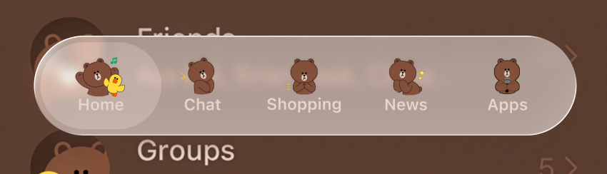
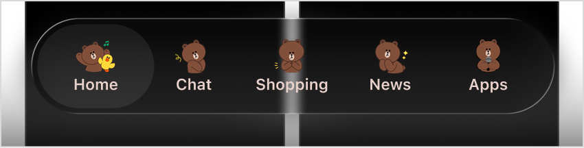
Menu example for iOS 26 and above
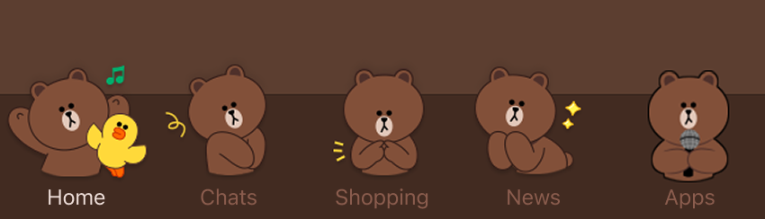
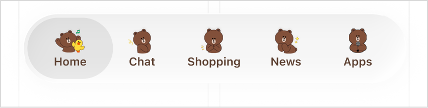
Menu example for iOS versions below 26 and Android
Please prepare menu images.
(The menu bar displayed to users will vary by service or region.)
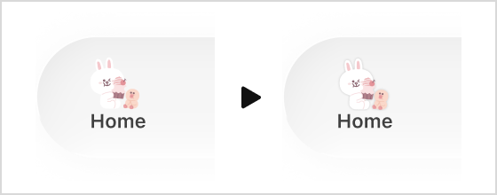
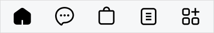 Home
Chats
Shopping
News
Apps
Home
Chats
Shopping
News
Apps
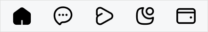 Home
Chats
Voom
TODAY
Wallet
Home
Chats
Voom
TODAY
Wallet
Please prepare two versions: one for the Unselected (OFF) status and one for the Selected (ON) status.
Please pay close attention to the margins on each side when creating the images.
OFF
ON
Menu button image notification badges
A notification badge icon with either a number or "N" mark will be shown over your menu button images. The badge location cannot be changed, so we recommend keeping it in mind when designing your button images. Note: Display of the badge icon is automatically controlled by the LINE app and doesn't require any additional images from creators. The badges will appear over every tab menu button image.
Badge size : 32 x 32 pixels
Badges will be displayed over your menu button images in the position shown on the right, relative to the menu button image size.
For iOS 26 and later: The badge will be placed in the top right corner of the image area.
When displayed in landscape
In landscape mode (when the device is held horizontally), the image area, including the badge, may overlap with the text area in some locations. Please take this into account when creating images.
Required images
| Quantity | Size | Menu Button Images | |||||||||
|---|---|---|---|---|---|---|---|---|---|---|---|
| Type |  Home Home |
 Chats Chats |
 Voom Voom |
 Shopping Shopping |
 Calls Calls |
 News News |
 TODAY TODAY |
 Wallet Wallet |
 Apps Apps |
||
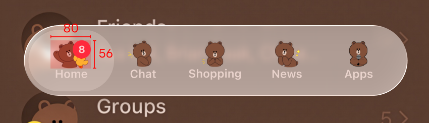
| 18 | 80 × 56 pixels |
OFF |  i_29_g.png i_29_g.png |
 i_03_g.png i_03_g.png |
 i_33_g.png i_33_g.png |
i_35_g.png |
 i_07_g.png i_07_g.png |
 i_25_g.png i_25_g.png |
i_31_g.png |
 i_27_g.png i_27_g.png |
i_37_g.png |
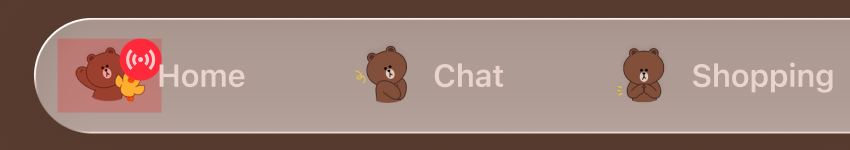
| ON |  i_30_g.png i_30_g.png |
 i_04_g.png i_04_g.png |
 i_34_g.png i_34_g.png |
i_36_g.png |
 i_08_g.png i_08_g.png |
 i_26_g.png i_26_g.png |
i_32_g.png |
 i_28_g.png i_28_g.png |
i_38_g.png |
||
Icon visibility
The iOS 26 design makes it more likely for the menu area to be affected by the background (such as photos and colors).
Please ensure that your icons' designs are clearly visible against both black and white backgrounds.
Against a white background
Against a black background
Tips
The design of iOS 26 creates some situations where you must consider how icon designs appear over transparent backgrounds.
Images framed around the bust (upper body)
Since the image area has changed, some images framed around the bust may be cut off, and cropping adjustments may be required.
Images without outlines
These images may blend into the background, so you may need to consider adding an outline or adjusting the coloring.
Semi-transparent images (without fill)
These images may blend into the background, so you may need to consider solutions such as adding a background to the icons.
Please prepare menu images.
- The menu bar displayed to users will vary by service or region.
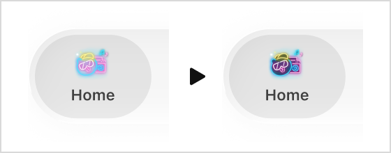
Home
Chats
Shopping
News
Apps
Home
Chats
Voom
TODAY
Wallet
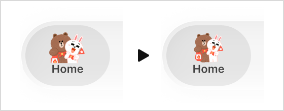
Two variations are needed, one for when the tab is unselected (off) and one for when it's selected (on).
There should be a margin of around 10 pixels between the trimmed image and the content around it. Please consider the balance of the stickers when creating your designs.

OFF

ON
Menu Button Image Notification Badges
A notification badge icon with either a number or "N" mark will be shown over your menu button images.
The badge location cannot be changed, so we recommend keeping it in mind when designing your button images.
Note: The badge icon display is automatically controlled by the LINE app and doesn't require any additional images from creators.
The badges will appear over every tab menu button image.
Badge size : 33 × 33
The badge will be displayed over the top right corner of your menu button images with the following margins.
· Top: 49 pixels
· Right: 21 pixels
Required images
| Quantity | Size | Menu button images | |||||||||
|---|---|---|---|---|---|---|---|---|---|---|---|
| Type | Home |
Chats |
Voom |
Shopping |
Calls |
News |
TODAY |
Wallet |
Apps |
||
| 18 | 128 × 150 | OFF |  i_29.png i_29.png |
 i_03.png i_03.png |
 i_33.png i_33.png |
i_35.png |
 i_07.png i_07.png |
 i_25.png i_25.png |
i_31.png |
 i_27.png i_27.png |
i_37.png |
| ON |  i_30.png i_30.png |
 i_04.png i_04.png |
 i_34.png i_34.png |
i_36.png |
 i_08.png i_08.png |
 i_26.png i_26.png |
i_32.png |
 i_28.png i_28.png |
i_38.png |
||
C. Menu Background Images
You can optionally create a menu background image. If you don't create one, the background design of the selected color skin or background color will be used instead.
The menu background is aligned to the left.
Tips
The image should be between 100 and 150 px in height. Background images less than 101 px in height can't be made transparent. Make sure your image is between 101 and 150 px in height to use transparency.
In the image below, the illustration portion is 130 px and the transparent portion is 20 px.
Please prepare the image so that it can repeat seamlessly.
Any gaps in your transparent backgrounds may appear as black areas. Please check your theme thoroughly on the preview screen before submitting it.

Illustration height: 130 Transparent margin: 20Pattern150 px height
Required images
| Quantity | Menu background images | File Name | Size |
|---|---|---|---|
| 1 (Optional) |  |
i_11.png | 1472 x 150 |
D. Passcode Image
Images shown when a passcode is being set.
Two variations are needed, one for when the tab is unselected (off) and one for when it's selected (on).
Tips
You can display the same image for all 4 digits, or a different image for each digit.

Only 1 image

4 images
Required images
| Quantity | Passcode Digit | Type | iOS | Android | ||||
|---|---|---|---|---|---|---|---|---|
| Image | File Name | Size | Image | File Name | Size | |||
| 16 | 1 | OFF |  |
i_12.png | 120 x 120 |  |
a_12.png | 116 x 116 |
| ON |  |
i_13.png |  |
a_13.png | ||||
| 2 | OFF |  |
i_14.png |  |
a_14.png | |||
| ON |  |
i_15.png |  |
a_15.png | ||||
| 3 | OFF |  |
i_16.png |  |
a_16.png | |||
| ON |  |
i_17.png |  |
a_17.png | ||||
| 4 | OFF |  |
i_18.png |  |
a_18.png | |||
| ON |  |
i_19.png |  |
a_19.png | ||||
E. Profile Images


These images will be used as the default images for friends and groups if no profile image is selected.
Tips
Profile images are cropped into a circle in the app, but when the image is tapped in the LINE app, all four corners of the image are displayed. Therefore, profile images should be designed to fill a rectangular space.

Individual

Group
Required images
| Category | Quantity | iOS | Android | ||||
|---|---|---|---|---|---|---|---|
| Image | File Name | Size | Image | File Name | Size | ||
| Individual | 2 |  |
i_20.png | 240 x 240 |  |
a_20.png | 247 x 247 |
| Group | 2 |  |
i_21.png |  |
a_21.png | ||
F. Chat Background Image


Message input field
Transparent/background
Chat
You can optionally create a chat background image. If you don't create one, the background design of the selected color skin or background color will be used instead.
The image is always centered and aligned to the bottom, regardless of the orientation of the device.
Tips
Your images can be any size between the minimum and maximum values. You can also use both transparent and non-transparent images.
- If a transparent image is used, it will appear superimposed on the color skin.
Images must be 1 MB or less in size.
iOS
Maximum size: 1482 × 1334 px
Minimum size: 60 × 60 px
Position: Above message input field
(When the device is in portrait orientation, this becomes 640 × 1334 pixels.)
Android
Maximum size: 1300 × 1300 px
Minimum size: 60 × 60 px
Position: Below the message input field
Note: The bottom part of the image overlaps with the message input box, so please design the image with the height of the input box in mind.
Required images
| Category | Quantity | iOS | Android | ||||
|---|---|---|---|---|---|---|---|
| Image | File Name | Size | Image | File Name | Size | ||
| Chat Background Image | 2 (Optional) |  |
i_22.png | 1482 x 1334 | |
a_22.png | 1300 x 1300 |
Chat Screen Background Color
If you use a chat screen background image, it may not fill all devices' screens. Any excess space is filled in with your theme's color skin by default. Use one of the following methods to prevent any jarring breaks.
• Select a background color that matches your chat screen's background color.
• Create a chat screen background image that matches your color skin.
• Keep your chat screen background image transparent to blend it with either your selected background color or color skin.
| Image doesn't fill the screen | Set background color | Match with the color skin | Create transparent background image |
|---|---|---|---|

Color skin Chat Background Image |
 |
 |
 |
The top of the image doesn't fill the screen, revealing the color skin. |
Select a background color that matches the chat screen background image's color. |
Select a background color that matches the color skin. |
Keep the background image transparent to blend with either your selected background color or the color skin. |

